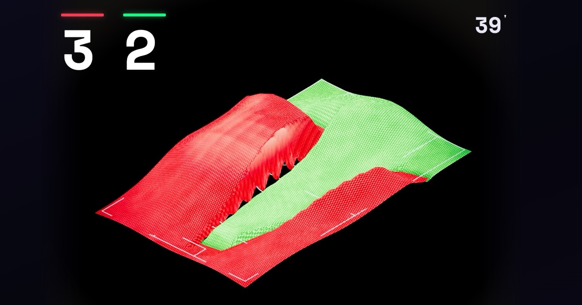
A soccer game is one of the densest data objects in sport: thousands of passes, hundreds of shots, and ninety minutes of changing pressure. Most visualizations flatten it into graphs that only a specialist understands. Data Portraits, the project of Alexander Bogachev at wc26.bogachev.fr, does the opposite: it returns that entire array to something that everyone already recognizes — two teams, one field, and the feeling of a game swinging back and forth.
«It's an impression, but one built entirely from data», summarizes the site's cover. Nothing is staged: each match is reconstructed from around 1,500 events — every touch, pass, shot and card. The result is not a dashboard: it is a unique scene that goes through the game in dramatic time.
How to read the portrait without labels
Bogachev designs the system to be read with the eye, not with legends. On the page About he explains seven visual layers that coexist in the same scene:
| Element | What does it represent | Data source |
|---|---|---|
| Two blankets | Territory / possession by team, in national color | Momentum FotMob (valueNorm) |
| Sewing | Battle front that advances or retreats with pressure | Momentum FotMob |
| The relief | Hills where there are shots; height = shot quality (xG) | WhoScored / Opt |
| Goal flood | The entire field is dyed the color of the team that scores | Goal Events |
| Tilt of the sky | Ambient reading of who is winning | Momentum FotMob |
| Lower pulse | Minute-by-minute momentum seismograph | Momentum FotMob |
| Penalty shootout | Final choreography with each successful or missed throw | Shootout events |
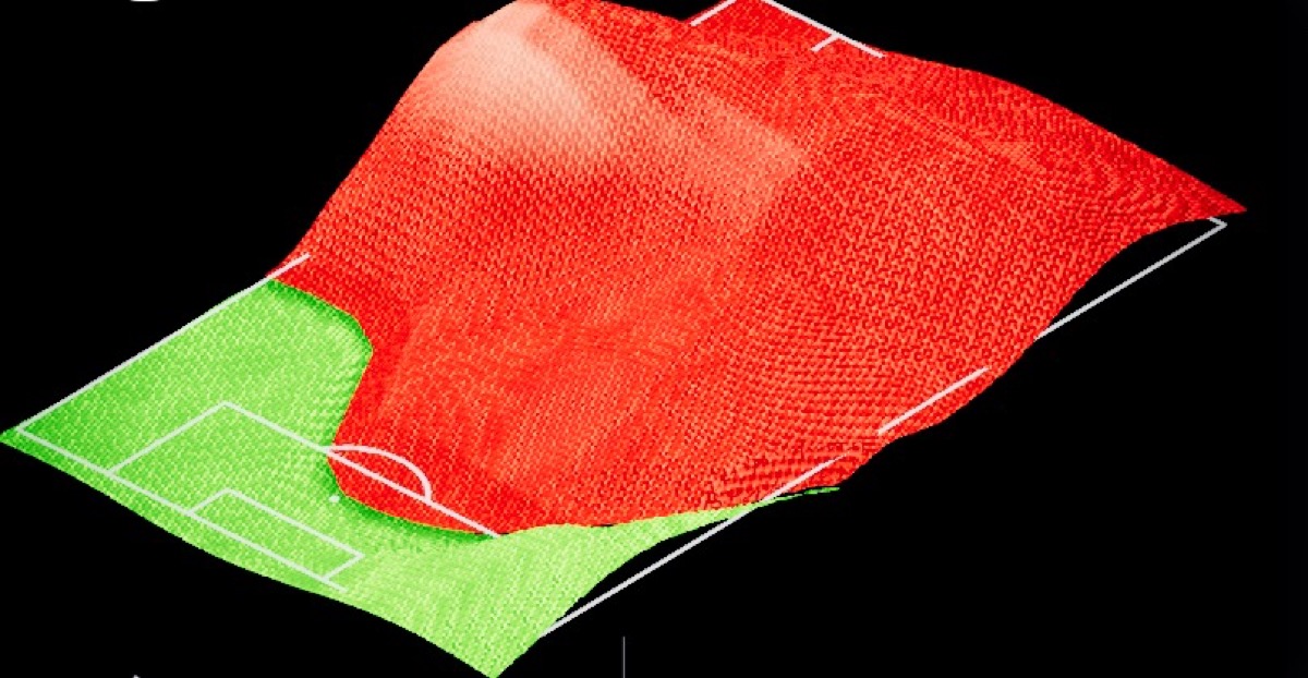
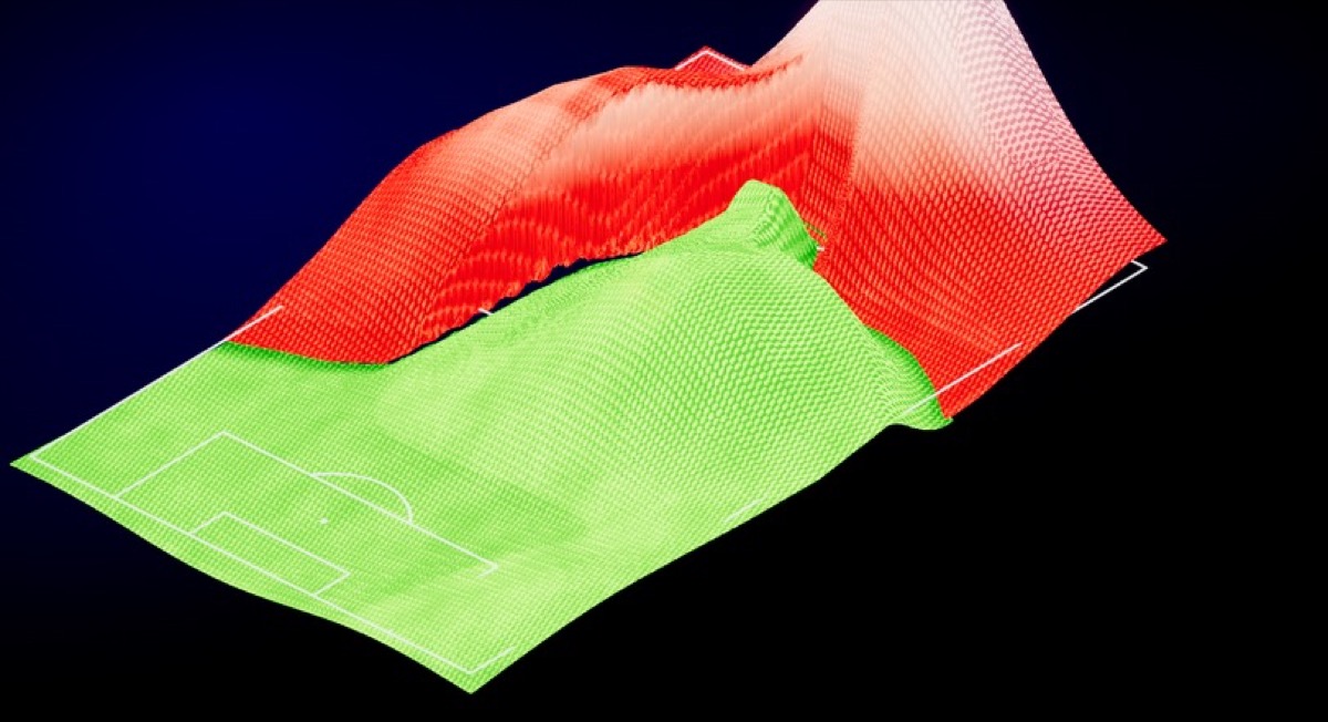
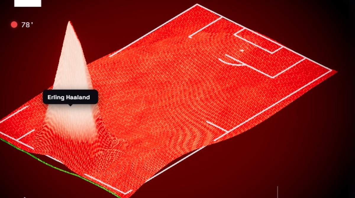
The three previous examples belong to the same real round of 16 match: Brazil 1-2 Norway. This is the case that Bogachev uses in his documentation to demonstrate that the image is enough to read the encounter.
Video: official summary Brazil 1-2 Norway (eighth rounds)
Erling Haaland's two goals that eliminated Brazil — the same game that Data Portraits breaks down into blankets, relief and pulses. Source: FIFA — Highlights Brazil 1-2 Norway (YouTube)
Methodology: two sources, one own model
Bogachev clearly separates meaning (data) from execution (art). The minute-by-minute momentum comes from FotMob — the normalized valueNorm signal — and feeds the possession tide, sky tilt, and bottom pulse. Shots, goals, cards and xG values come from Opta data via WhoScored; From there comes the relief and the exact moment of each goal flood.
The mapping of those numbers to fabric, terrain, and light is yours: a custom-built generative system, not a reusable template. And the golden rule of the project is explicit: «No mock data, no procedural noise for decoration». If there is a hill, there was a shot; If the front moved, the momentum moved with it.
Honest limitations
Bogachev does not sell a literal replay. The possession front and the embossing go through a softening filter (low-pass) so that the fabric breathes instead of flickering second by second. Player positions and territory are a reconstructed approximation from the flow of events — the form of the game, not the exact GPS tracking.
Time is not linear either. The clock runs in dramatic time: it stops on goals and big chances and accelerates in routine passing phases. The order of events is faithful; the on-screen pacing is deliberately distorted to tell the story of the match.
Functional art for a global audience
Bogachev defines the project as functional art: beauty that comes from being truthful. Football is, according to him, one of the few data-rich topics that a global audience already knows how to read — the perfect bridge between a serious analytical dataset and a viewer who has never opened a spreadsheet.
The ambition is both simple and difficult: take a huge, honest array of a match and make its structure instantly readable and genuinely beautiful, so that a lifelong analyst and someone watching their first World Cup can look at the same image and understand the same game.
The site links his Instagram account (@wc26.dataportraits) and Bogachev's professional profile. It is not a commercial product or a betting dashboard: it is an editorial visualization piece that accompanies the tournament from another perspective — that of the information designer who turned medicine into compelling graphics and today leads visual experiences based on data.
Most read
What readers are engaging with right now.
- Culture
Goose, the gay app that competes with Grindr, reaches the top 4 of Lifestyle in the App Store

- World
Cubans protest in Miami against Airlines Connections for alleged scam: they demand up to $20,000 in packages to Punta Cana

- World
Trump declares the ceasefire with Iran over, orders new attacks in Hormuz and demands cutting trade with Spain in NATO
- Culture
Harry Potter on HBO: complete guide to the series (not yet released and already renewed for T2), dates, cast and controversies

- Culture
DUK App: Aly Sánchez launches her habits app "one day at a time" with a 63-day program
- Culture
I'm Edgy and Edgy Labs: From Nebraska's Walmart to a beef tallow cream brand that sells across the US.

- Culture
The Evening of the Year VI: all the winners, fights and performances of the Ibai night in Seville

- World
The FBI is investigating the AFA for alleged fraud and money laundering: about $300 million in sponsorships and operations in the US.
- World
El Cangrejo: profile of Raúl Guillermo Rodríguez Castro, Raúl Castro's grandson between GAESA, leaked luxuries and the first interview of 2026